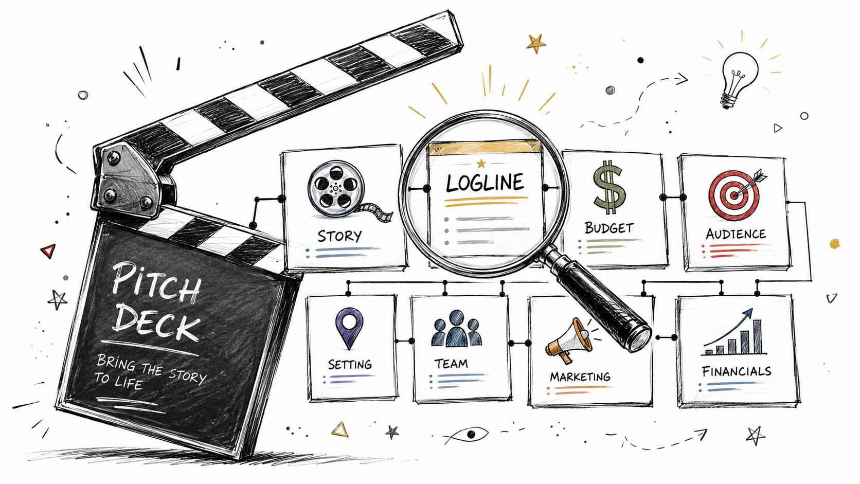
Create a Film Pitch Deck That Gets Funded
You've finished the script. You've revised it, table-read it, defended it to friends, and probably rewritten the first ten pages more times than you want to admit. Then comes the harder part. Getting someone with money, influence, taste, or distribution access to care before they've read a single scene.
That's where most filmmakers stall.
A screenplay can be excellent and still go nowhere if the project can't be understood quickly. Buyers, producers, financiers, and collaborators rarely meet your script first. They meet your package. In practice, that usually means a film pitch deck that explains what the film is, how it feels, who it's for, and why it has a credible path forward.
A good deck doesn't replace the script. It earns the right for the script to be read.
From Script to Screen A Pitch Deck Is Your Bridge
I've seen the same problem over and over. A writer has a strong feature, a documentary producer has access to a compelling subject, or a director has a clear visual approach, but none of it is packaged in a way that helps another person decide fast. The material may be good. The presentation doesn't help the project travel.
That's why the film pitch deck became standard practice. By the early 2000s, creators were already commonly packaging projects into concise visual presentations before approaching investors, producers, studios, or collaborators, and current industry guidance still centers on a compact set of slides that covers story, tone, audience, market position, and finance details in a fast read, as outlined by Pitch My Project's overview of what makes a strong pitch.
The useful mindset is this. Your deck is not homework. It's your project's ambassador.
A deck has to work before anyone falls in love with your script. That means clarity first, style second.
When a deck works, a producer can forward it without apology. An investor can skim it and know what kind of conversation to have next. A creative executive can tell whether the project belongs in their lane. That's the bridge from private enthusiasm to professional momentum.
A weak deck usually fails in one of two ways:
- It stays too literary. It reads like notes about a screenplay instead of a decision document.
- It goes too vague. It uses mood and aspiration but never proves the project can be made and positioned.
The strongest decks do both jobs. They protect the creative voice and answer practical questions. They make the film legible.
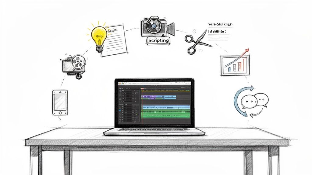
The Blueprint Before You Build Your Deck
The biggest mistake happens before the first slide. People open Canva, Keynote, PowerPoint, or Google Slides too early. Design feels productive, but strategy is what makes the deck persuasive.
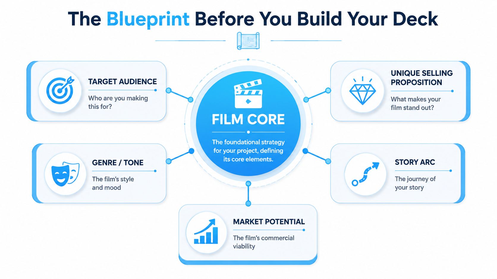
Define the film in one sentence first
If you can't explain the project clearly without slides, the slides won't save you. Before building the deck, write down five things in plain language:
- Core premise: What happens?
- Genre promise: What kind of experience is the audience buying into?
- Emotional engine: Why does this story matter beyond plot?
- Audience: Who is most likely to care first?
- Distinct hook: Why this film instead of another project in the same lane?
This sounds basic, but it cuts through a lot of confusion. A film can be original and still need a familiar entry point. If the reader doesn't know where to place it, they can't advocate for it internally.
Decide who the deck is really for
Not every reader looks for the same proof.
A creative executive often wants to know whether the voice is strong, the world is specific, and the filmmaker has a point of view. A financier tends to look for discipline. Can this team explain audience, positioning, budget logic, and a plausible route to market?
That doesn't mean you need completely different decks every time. It does mean you need a master deck and a customized version.
Here's a practical way to think about emphasis:
| Reader | They care most about | They lose interest when |
|---|---|---|
| Producer | Story, package, feasibility | The deck feels dreamy but unstructured |
| Investor | Risk, audience, comparables, budget range | Claims sound inflated or unsupported |
| Creative executive | Voice, tone, characters, clarity | The deck reads like accounting |
| Distributor or sales contact | Audience fit, positioning, release logic | The project has no market context |
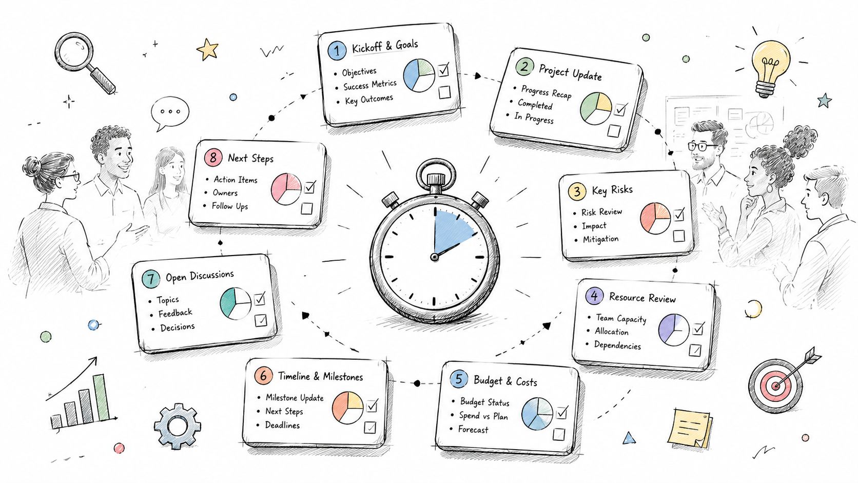
Across major film markets, the common framework has settled around a 10-slide model built for speed, with a widely used checklist covering title, logline, synopsis, tone and style, characters, target audience, comparables, team, budget and finance, and contact details, as described in this industry checklist on the 10-slide killer pitch deck.
Build the argument before the visuals
A strong film pitch deck makes a simple argument:
- This is the story.
- This is how it feels.
- This is who it's for.
- This is why it can work.
- This is who's making it.
- This is what's needed next.
Working rule: If a slide doesn't help someone say yes, cut it.
Mood boards, stills, typefaces, and color palettes matter. But they should support the argument, not distract from it. If you start with aesthetics, you'll often end up decorating uncertainty.
Crafting Each Slide for Maximum Impact
Investors and producing partners usually look for a sequence that quickly validates both the creative idea and the commercial logic. A practical order is title or logline, synopsis, character breakdown, visual style or moodboard, target audience, market analysis, and budget or financials, which mirrors what investor-facing guides identify as the most decision-relevant sequence in a film pitch deck breakdown from DreamX.
Start there. Then shape the rest around it.
Title and logline
This is your first test. If the title slide and logline don't create immediate orientation, the reader starts working too hard.
Your title slide should establish tone fast. The logline should explain protagonist, conflict, and hook in a compact form. Keep it specific. “A man confronts his past” is not a logline. “After his missing sister reappears with no memory of the last decade, a small-town paramedic uncovers a local trafficking ring tied to his own family” is at least doing the job.
What to include:
- Title: legible and tonally right
- Logline: one tight sentence
- Visual cue: one image or design choice that places the reader in the world
What to avoid:
- Tagline confusion: if your tagline is stronger than your logline, your premise may still be fuzzy
- Poster overload: a fake theatrical poster often looks premature unless it's executed at a high level
Synopsis and story engine
The synopsis slide isn't a plot dump. It should prove the film has propulsion.
Keep it lean. A few paragraphs are enough if each one advances the central engine of the story. Focus on the setup, the pressure, and what keeps the film moving. You don't need every twist. You do need to show that the premise can sustain a feature or that the documentary has a real narrative spine.
A useful test is this. If someone finishes the synopsis and still can't tell what happens for most of the runtime, it needs revision.
The synopsis doesn't need to reveal everything. It does need to prove there's an actual movie there.
Characters and point of view
Character slides often drift into casting fantasy. That's rarely the best use of the page.
Use this slide to show who matters, what each character wants, and how they create conflict or change. If you include reference images, make sure they communicate type and energy, not wishful attachments.
Good character copy tends to be short and active. Instead of a biography, write the dramatic function.
- Protagonist: what they want, what blocks them, what flaw costs them
- Antagonistic force: person, institution, secret, environment, or system
- Key supporting roles: how they sharpen stakes or theme
If you need help tightening this kind of material into a compact, readable summary, studying examples of executive summary writing that keeps complex material skimmable is worth your time. The same discipline applies to deck writing.
Visual style and moodboard
This slide should answer a simple question. What movie am I watching in my head?
Use images with intention. Pull frames, photography, design references, textures, architecture, wardrobe, or scenic elements that point toward the film's visual language. Don't use eight unrelated images because each looks cinematic on its own.
A strong moodboard has consistency in:
- Color temperature
- Lighting philosophy
- Composition
- Scale
- Emotional tone
Put a sentence or two on the slide if needed. Not to explain the obvious, but to direct interpretation. “Naturalistic daylight, boxed interiors, and compressed close-ups that trap the protagonist inside ordinary spaces” is useful. “Visually stunning and immersive” is empty.
A practical walkthrough can help when you're assembling the middle of the deck and trying to keep it moving.
Audience, market, and comparables
Many beautiful decks often collapse at this point. They describe the film but never position it.
The audience slide should identify who the first audience is, not “everyone who likes good movies.” Be honest about the lane. A niche audience isn't a weakness if you can show why it's reachable.
Comparables should do real work. Use them to frame tone, scale, audience expectation, or release logic. Don't pick giant prestige titles just because they're good. Pick titles that help the reader understand your project's place in the market.
Try this structure:
| Slide element | Strong version | Weak version |
|---|---|---|
| Audience | “Fans of contained survival thrillers and elevated relationship drama” | “General audiences” |
| Comps | Similar tone, budget lane, or release path | Famous titles with no practical similarity |
| Market note | Clear release logic and positioning | Broad claims that the genre is popular |
Budget, team, and ask
Keep the financial slide readable. This is not where you paste a line-item budget. High-level framing is enough for the deck. The goal is to show that the project's ambition matches the production approach.
The team slide should establish confidence, not inflate credentials. If you're emerging, don't fake stature. Highlight what's real. Relevant shorts, festival history, production experience, subject access, regional expertise, or a strong producing partner all count.
Close with a specific ask. If you want financing, say so. If you're seeking a producer, sales conversation, or development partner, say that instead.
Design and Writing That Sells Your Vision
Bad design doesn't just look amateur. It creates doubt. If the deck is hard to read, cluttered, or tonally inconsistent, the reader starts questioning your judgment long before they get to the budget slide.
Industry presentation guidance often points to the 10-20-30 rule, meaning 10 slides, 20 minutes, 30-point font, because it reduces cognitive load and helps avoid common failure points like text-heavy slides and distracting animation, as summarized in Figma's resource on pitch deck examples.
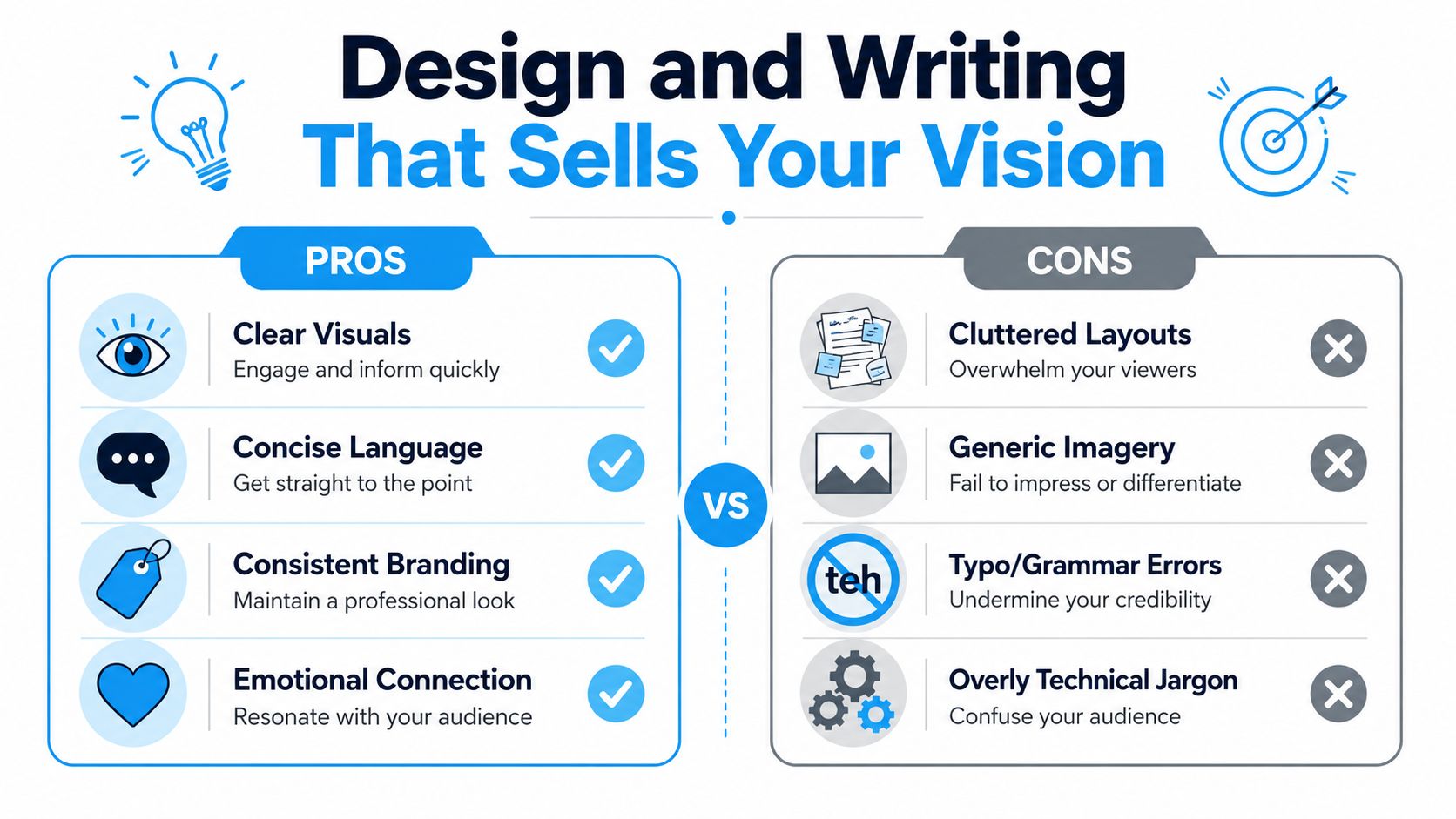
Clean beats clever
A lot of filmmakers over-design because they think polish means complexity. Usually it means restraint.
Do this:
- Use one visual system: one or two fonts, one palette, one image treatment
- Protect whitespace: let the slide breathe
- Keep hierarchy obvious: title first, support second, detail third
- Choose readable type: if it looks stylish but slows reading, it fails
Not that:
- Tiny text blocks
- Multiple font personalities
- Animated transitions
- Fake studio branding
- Busy backgrounds behind copy
Write like a producer, not a brochure
Deck copy should sound confident and plain. You're not writing ad copy for a launch campaign. You're helping another professional assess a project.
That means cutting lines like:
- “A groundbreaking cinematic journey unlike anything audiences have ever seen”
- “A powerful and unforgettable story with universal themes”
Replace them with language that carries information:
- “A contained thriller set over one night in a flood zone”
- “A character-driven drama built around a mother and daughter reunion”
- “Designed for festival launch and platform-friendly discovery”
If you want a useful outside reference on tightening language, principles from effective website content strategies apply surprisingly well to decks. Clear headlines, strong hierarchy, and concise copy work because people scan before they commit.
A practical check: Shrink the deck to thumbnail view. If the pages all look equally dense, nothing important is standing out.
Design should reinforce genre
Every visual choice teaches the reader how to feel about the project.
A horror deck can use shadow, contrast, and spare copy. A family drama may benefit from warmth, softer spacing, and intimate imagery. A documentary deck may lean on credibility and access rather than stylization.
The point isn't to mimic the finished movie. It's to create alignment between what the deck says and how it behaves. When design and writing agree, the project feels intentional.
Your Pitch Strategy Beyond the Deck Itself
A strong film pitch deck in the wrong inbox is still a dead document. Outreach matters as much as the deck because film financing and packaging are driven by fit. You need the right reader, the right framing, and the right follow-up.
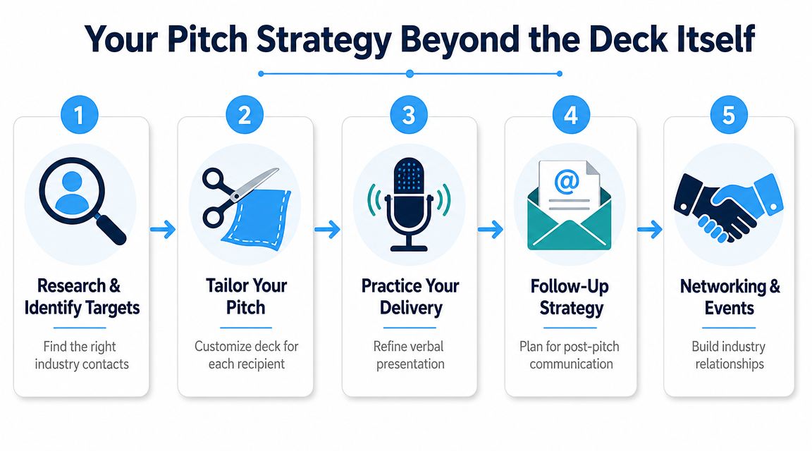
Research before you send
Start with alignment, not volume. Look at producers who make work in your budget lane, genre area, or release space. If you're pitching a contained psychological thriller, don't lead with people whose slate is broad studio comedy. If you're packaging a documentary with unusual access, prioritize people who understand nonfiction rights, archival issues, and impact or broadcaster pathways.
Your outreach list should be short enough that you can tailor each message.
A simple first email works best:
- One-line reason for contacting them
- One-sentence project description
- Brief reason the fit makes sense
- Ask for permission or interest, not instant commitment
Evidence beats optimism
In a cautious market, vague confidence doesn't land. Guidance aimed at current film pitching has stressed that a deck is more persuasive when it shows evidence instead of aspiration, especially when distribution assumptions are harder to justify. One verified benchmark worth keeping in mind is that streaming accounted for 41.4% of total U.S. TV usage in 2024, which reinforces how fragmented viewing behavior has become, making generic release claims less convincing, as noted in this discussion of evidence versus aspiration in modern deck strategy.
That changes the standard for your outreach package.
Have backup material ready:
| Claim in your deck | What you should be ready to support with |
|---|---|
| Audience fit | Real audience logic and comps |
| Distribution route | Plausible pathway, not fantasy |
| Budget range | Top-sheet discipline and production assumptions |
| Team capability | Credits, proof of work, access, or execution history |
If crowdfunding is part of your financing path, the same discipline applies there. Planning, audience clarity, and proof of traction matter more than enthusiasm alone. This guide to launching a data-driven campaign is useful because it treats outreach as a system, not just a plea for support.
Package the conversation, not just the PDF
The deck is the centerpiece, but it shouldn't be the only asset. Keep a short verbal pitch ready, a one-page summary if needed, and any rights or access paperwork organized.
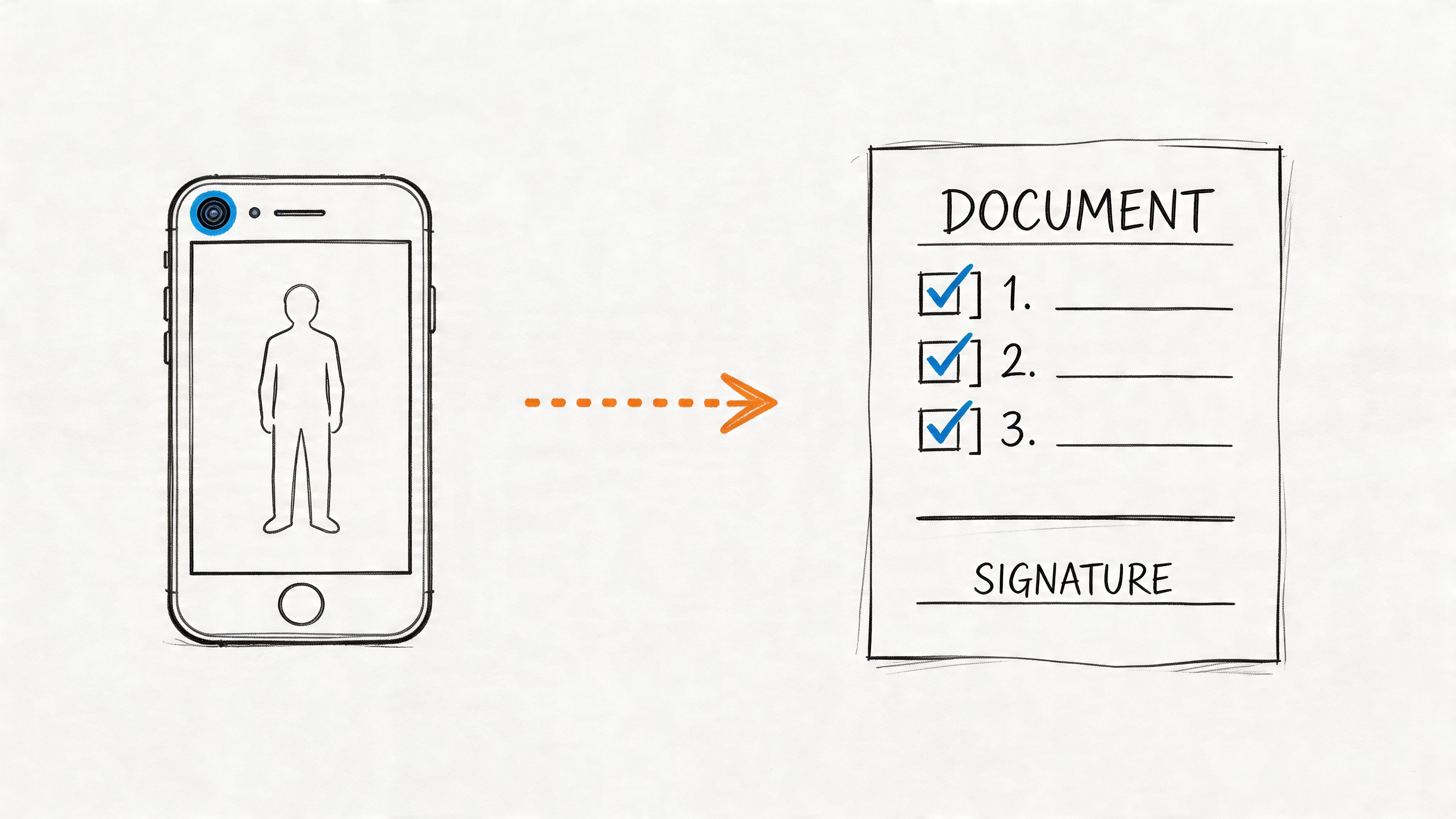
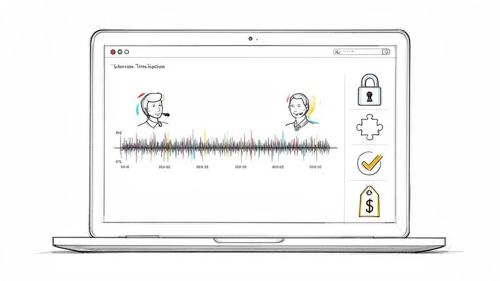
If your package includes sizzle material, interviews, or behind-the-scenes footage with people on camera, make sure your paperwork is clean. A simple resource on using a video recording release form correctly is helpful for keeping that side of the process organized before materials start circulating.
Send fewer decks. Send better-fit decks. Most bad outcomes come from weak targeting, not weak projects.
Optimizing Your Pitch for the Modern Workflow
A lot of deck advice still assumes the big moment happens in the room. That's outdated.
Hybrid work is now standard across many knowledge sectors, with employees spending 30% to 40% of their time in the office on average, and film pitch guidance has started to reflect the obvious consequence: there's growing need for decks that are optimized for remote, asynchronous review, not just live presentation, as discussed in this guide to creating a film pitch deck for current workflows.
Build for the skim
Most executives don't review decks under ideal conditions. They're opening them between calls, on laptops, in shared docs, sometimes on phones. Your deck has to survive that reality.
That means:
- Export a clean PDF
- Make text readable on small screens
- Name files clearly
- Keep navigation simple
- Avoid pages that require live narration to make sense
A remote-first deck should be understandable in silence. If a reader needs your spoken explanation to decode the argument, the document isn't doing its job.
Add assets that travel well
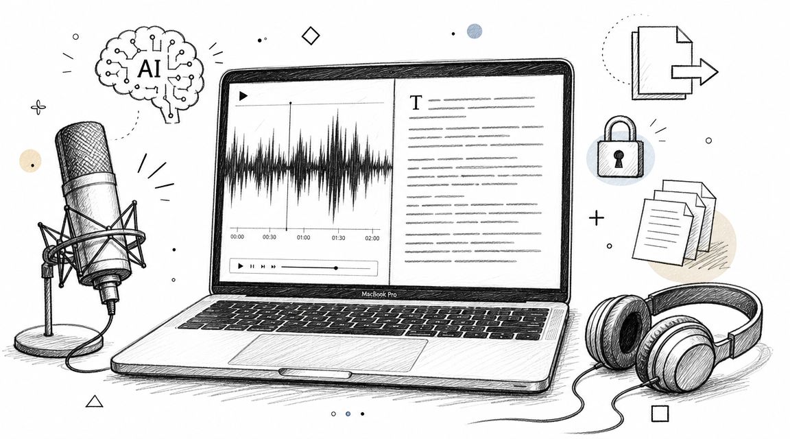
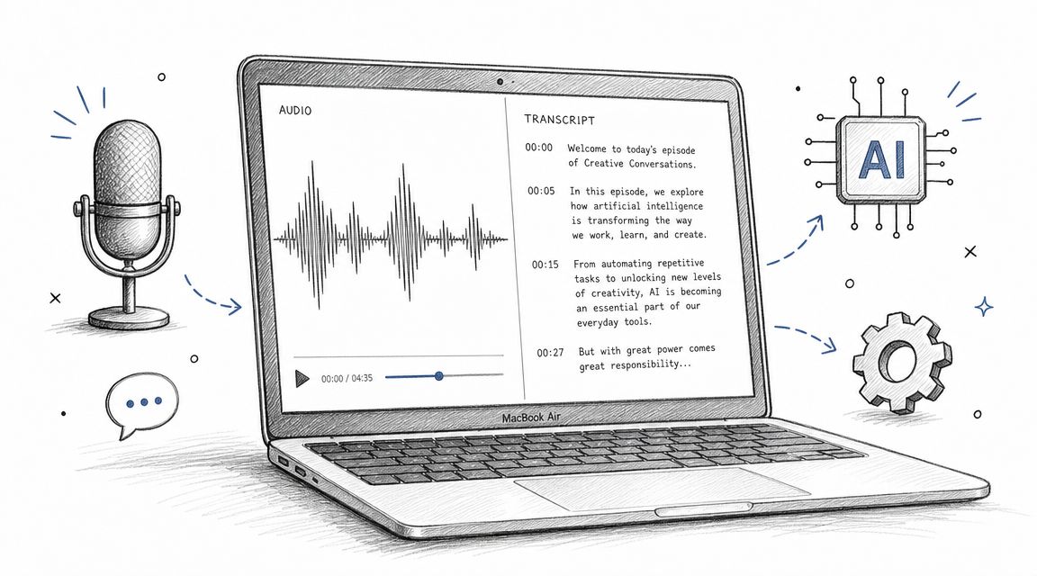
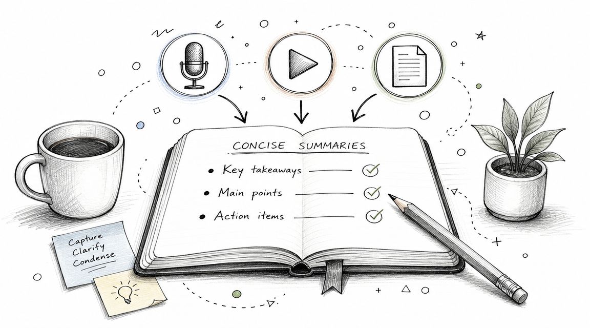
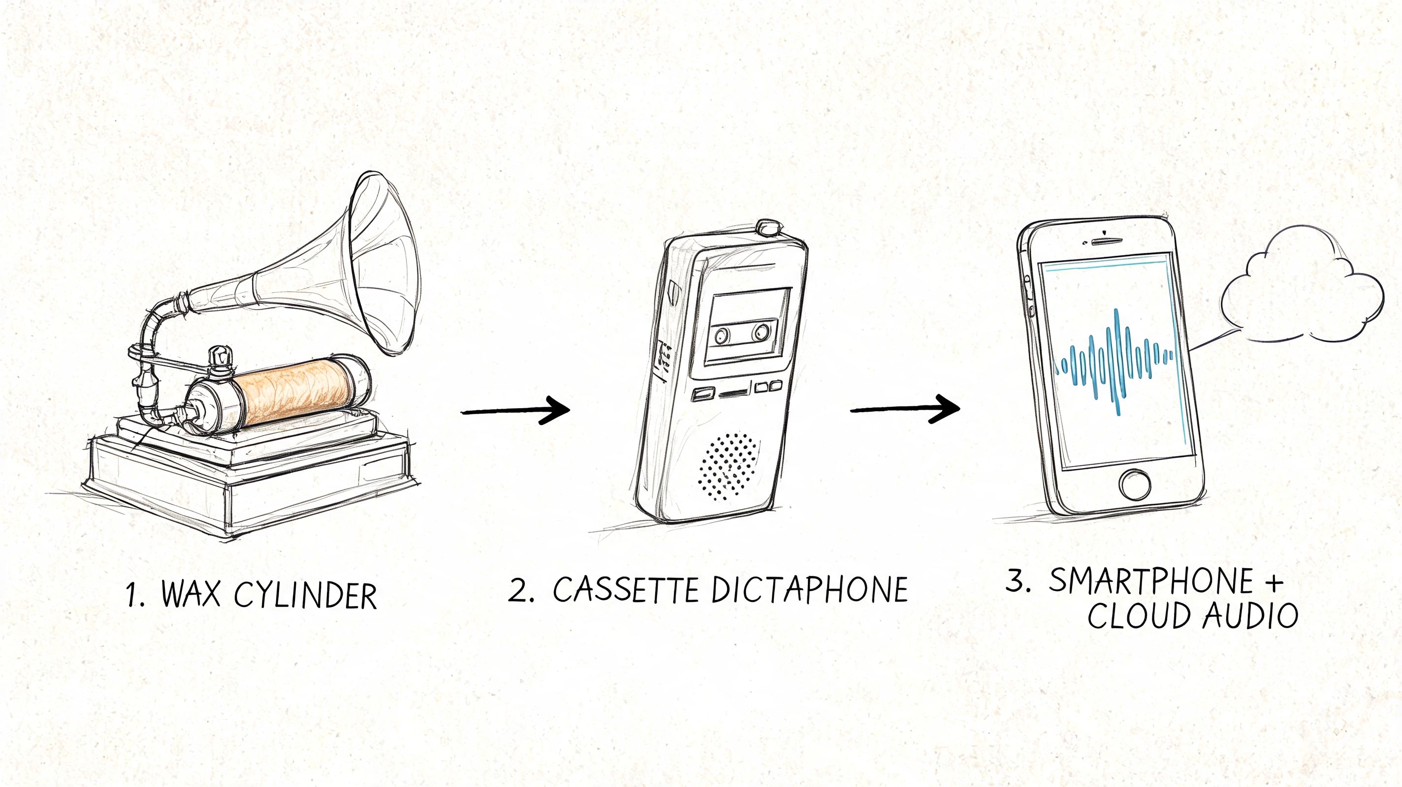
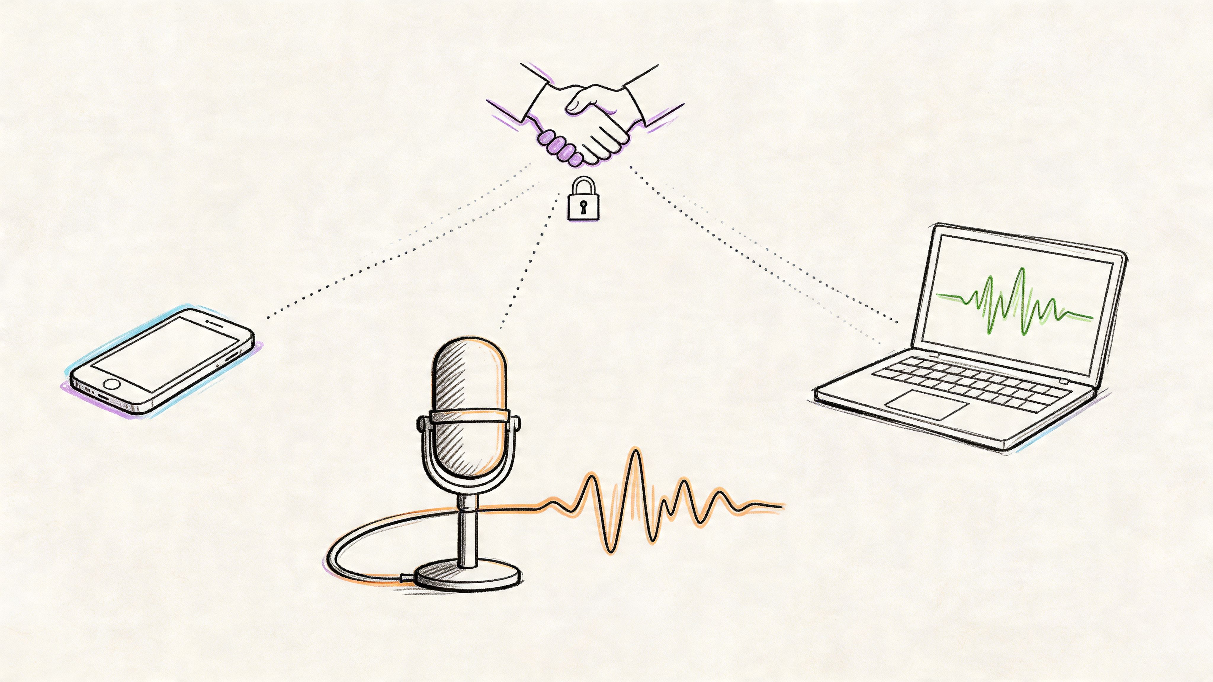
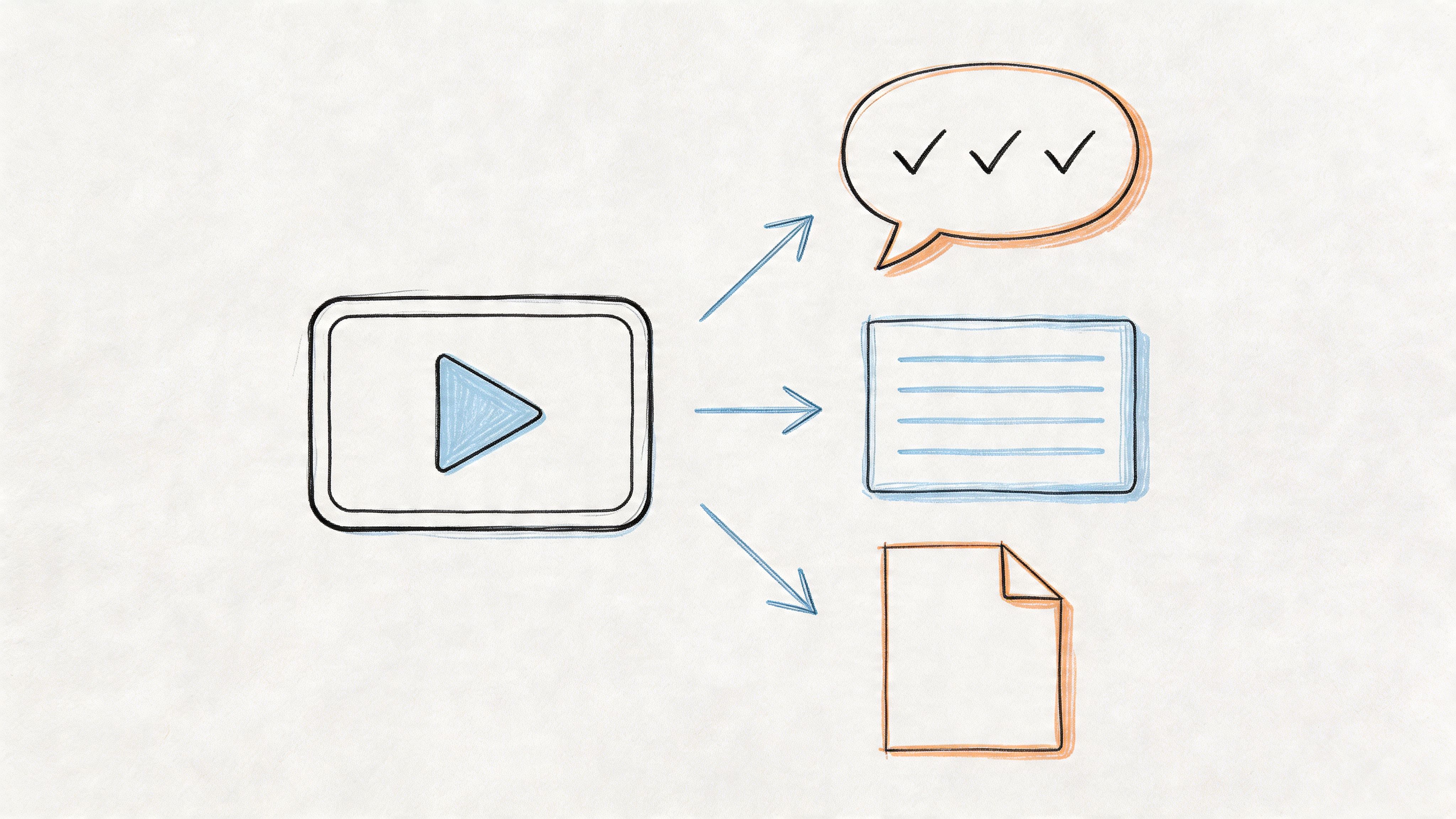
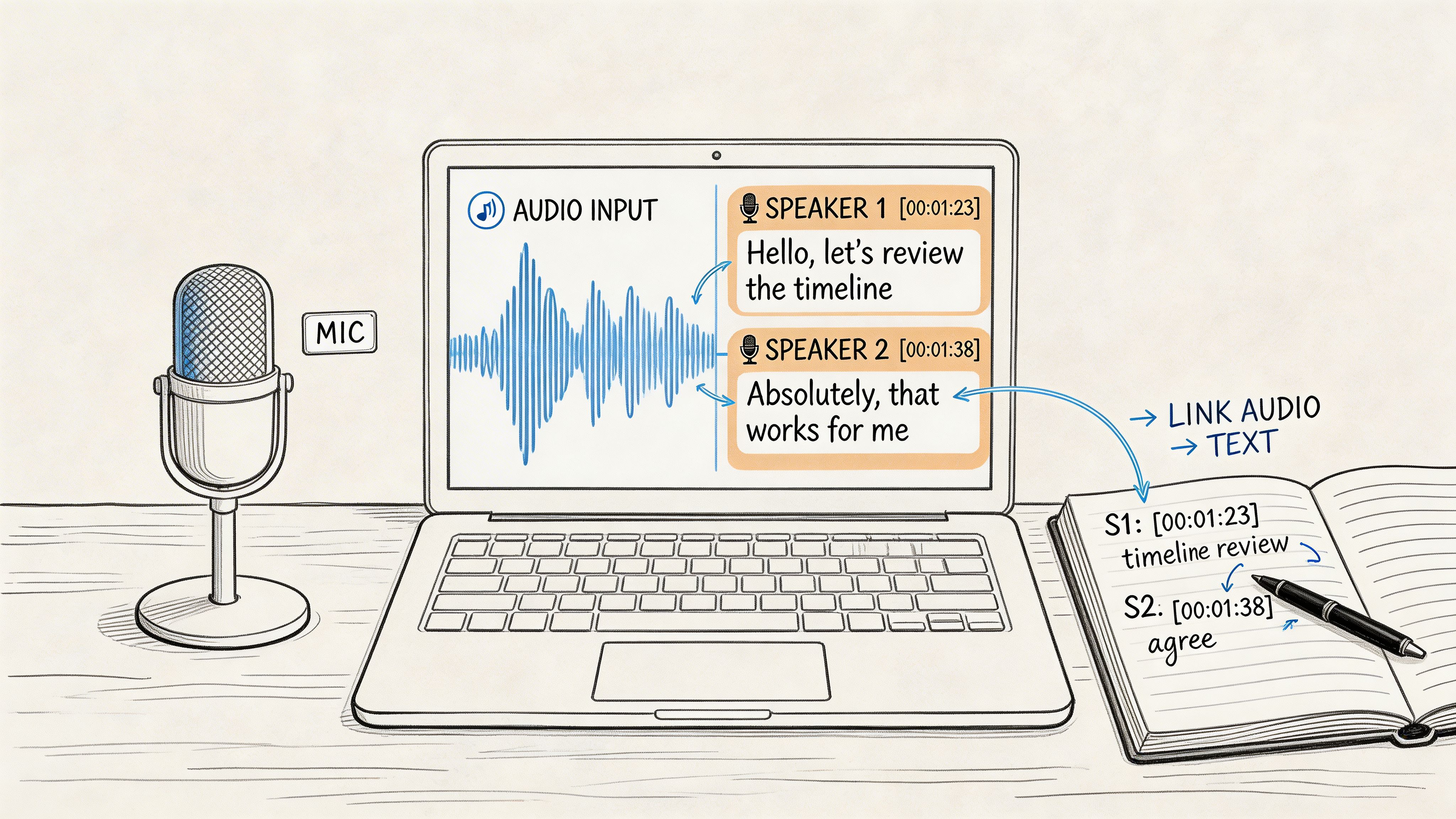
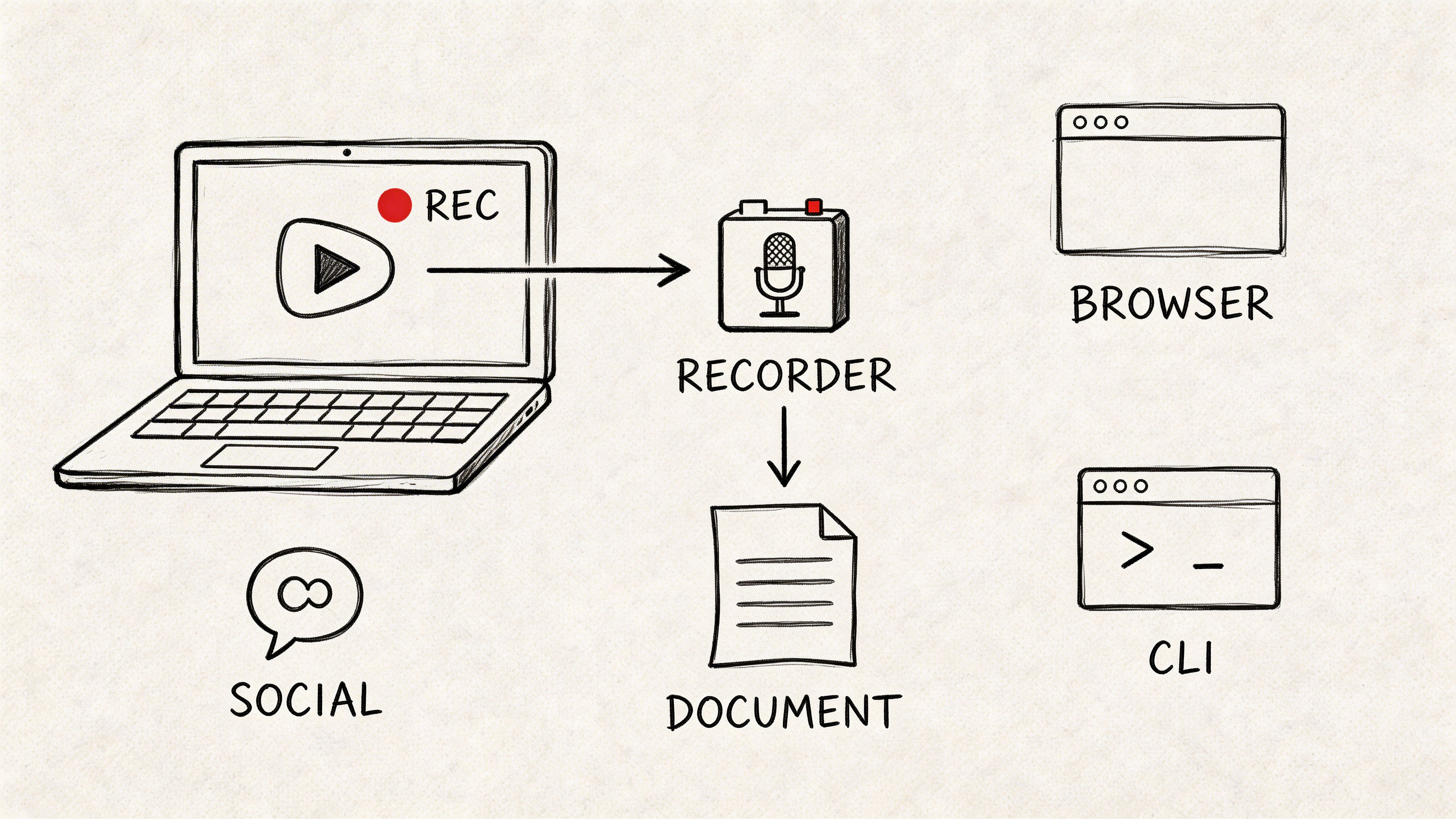
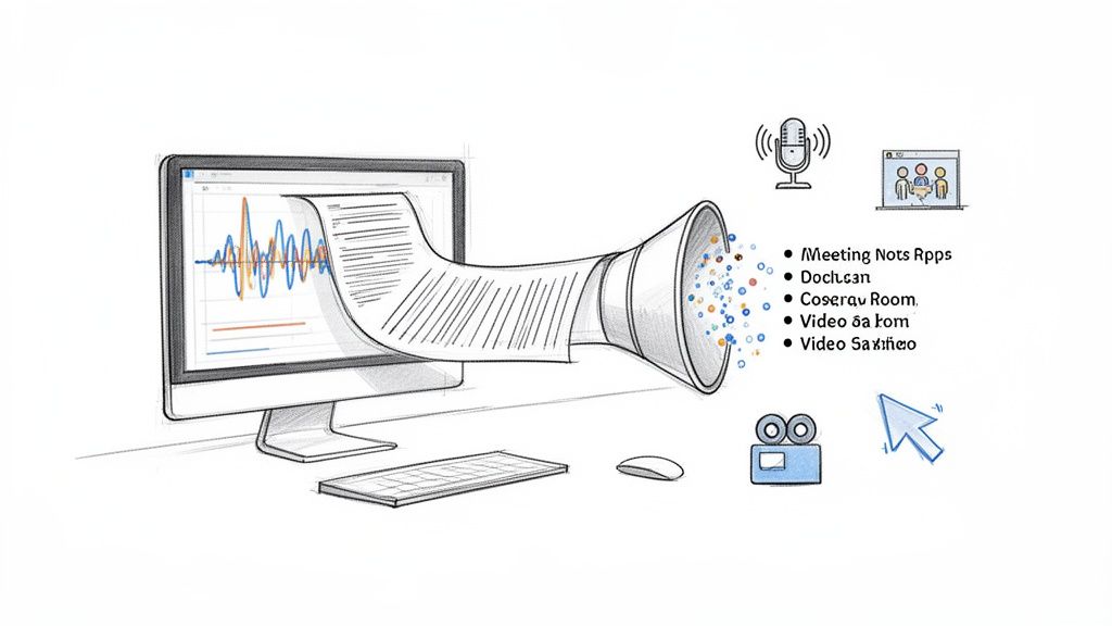
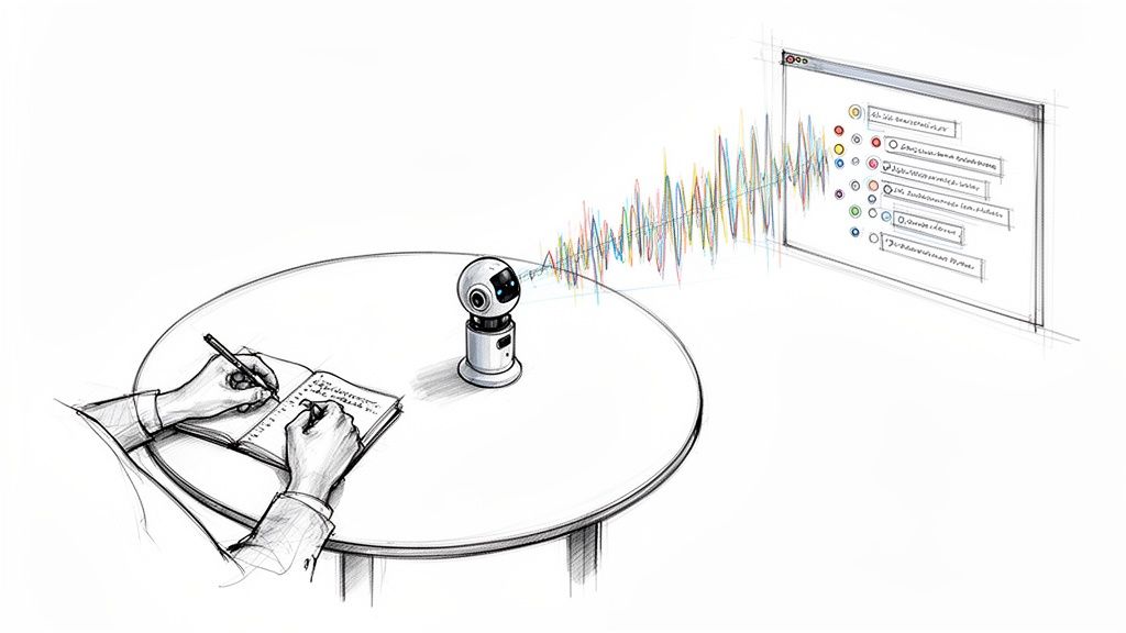
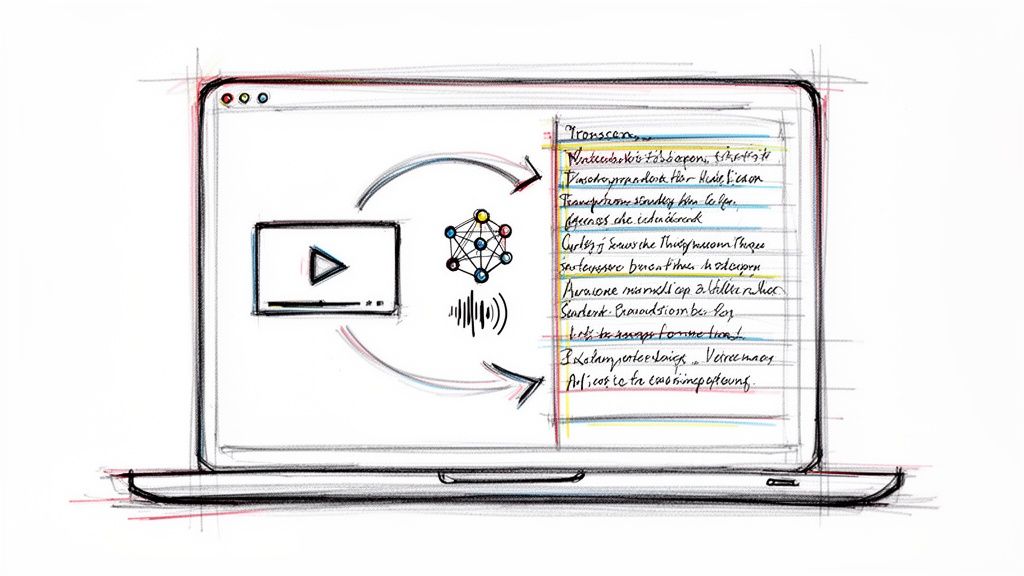
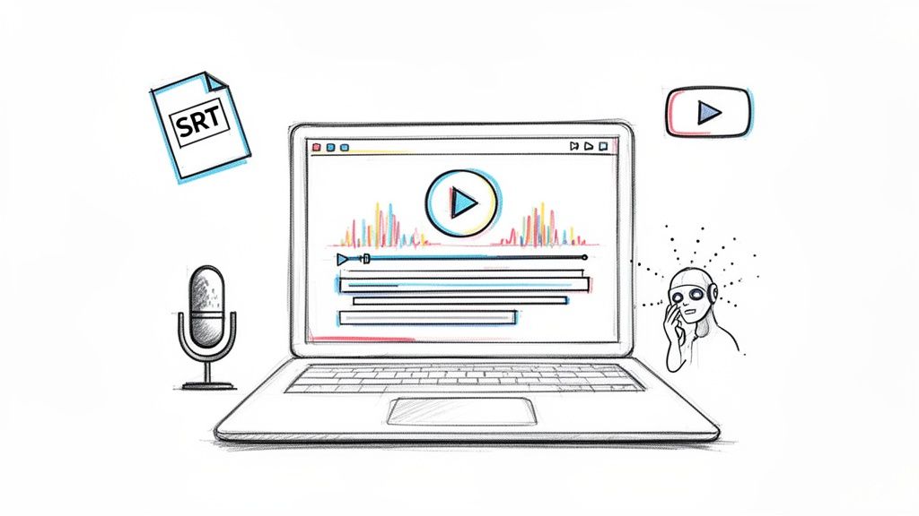
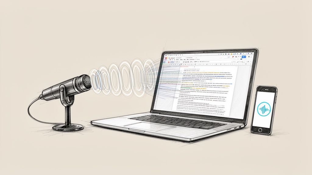
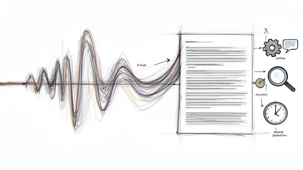
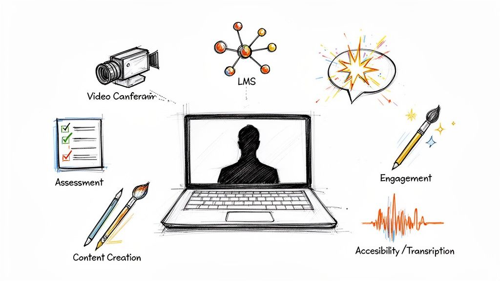
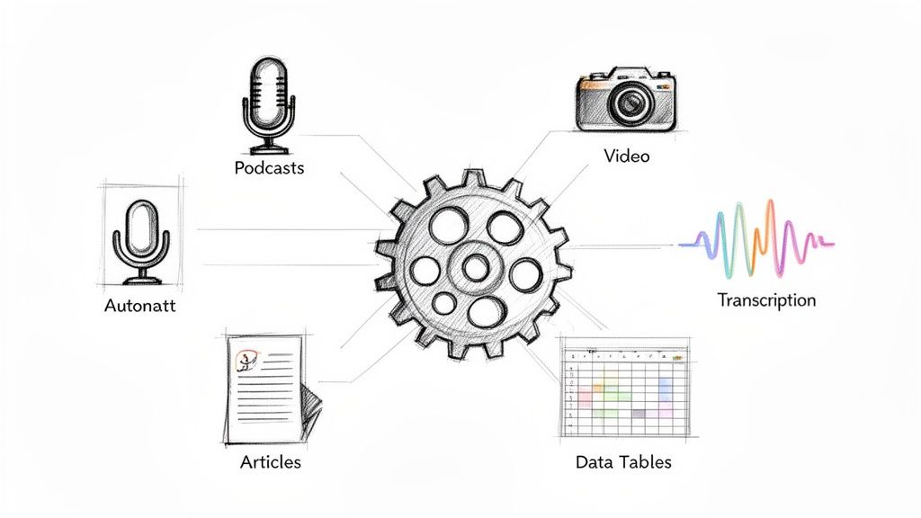
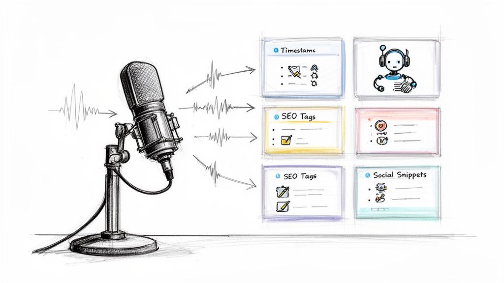
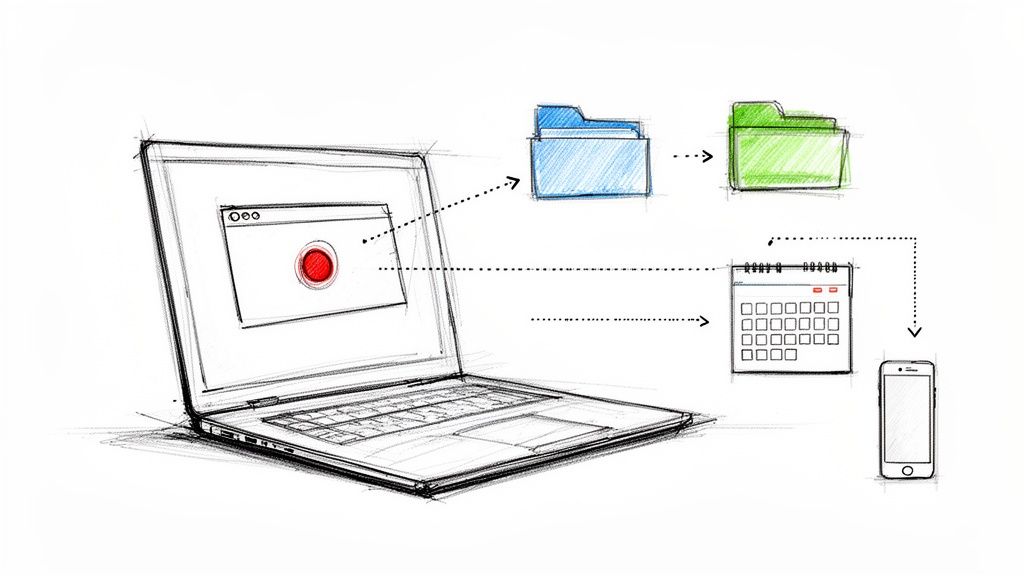
There's real value in a short spoken summary, but it has to be usable asynchronously. If you record a pitch video, keep it concise, and make sure the spoken material can be transcribed, searched, and summarized later. That gives busy readers another way into the project without forcing a meeting.
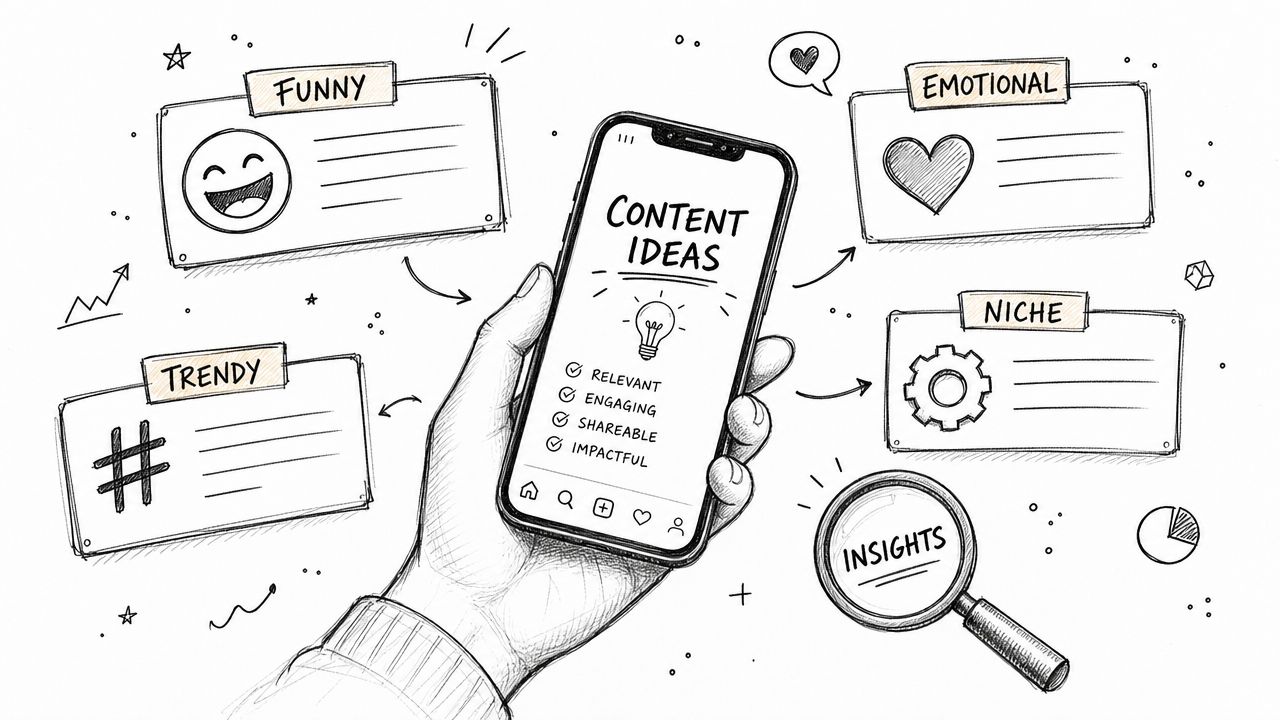
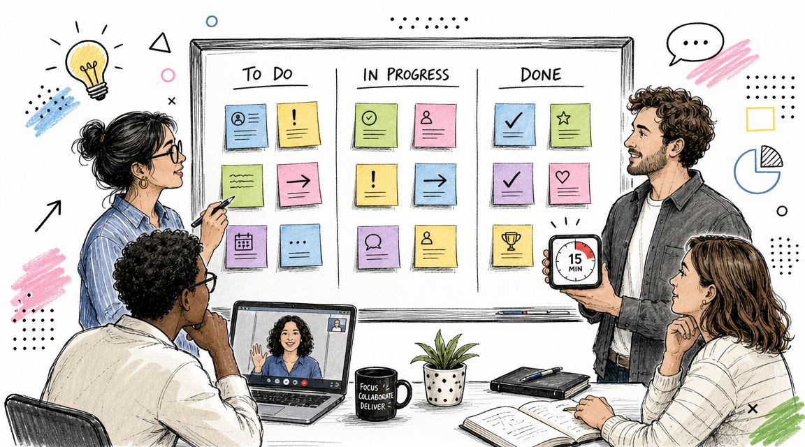
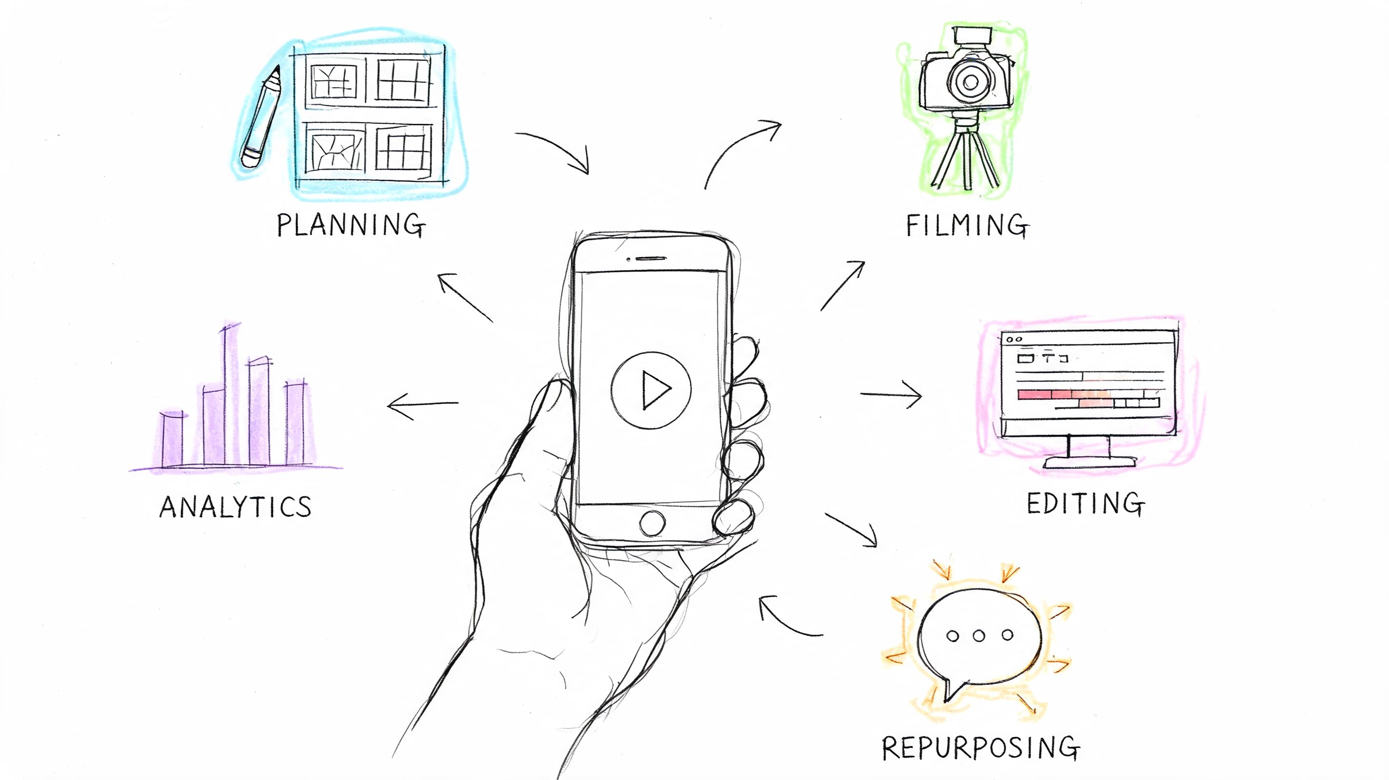
The smartest producers now treat pitch material as a small content system. The deck, summary, teaser, transcript, follow-up email, and Q&A notes should all support one another. If you want to think that way more systematically, this article on content repurposing in a practical workflow is a useful model.
Make it easy to forward
The final test is simple. Can one person pass your project to another without extra explanation?
That means your film pitch deck should answer the first-round questions clearly, use language that survives copy-paste into an internal email, and avoid visual gimmicks that break outside your laptop. In a remote-first environment, forwardability is part of fundability.
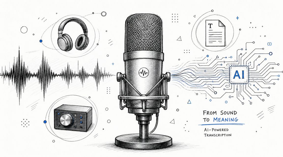
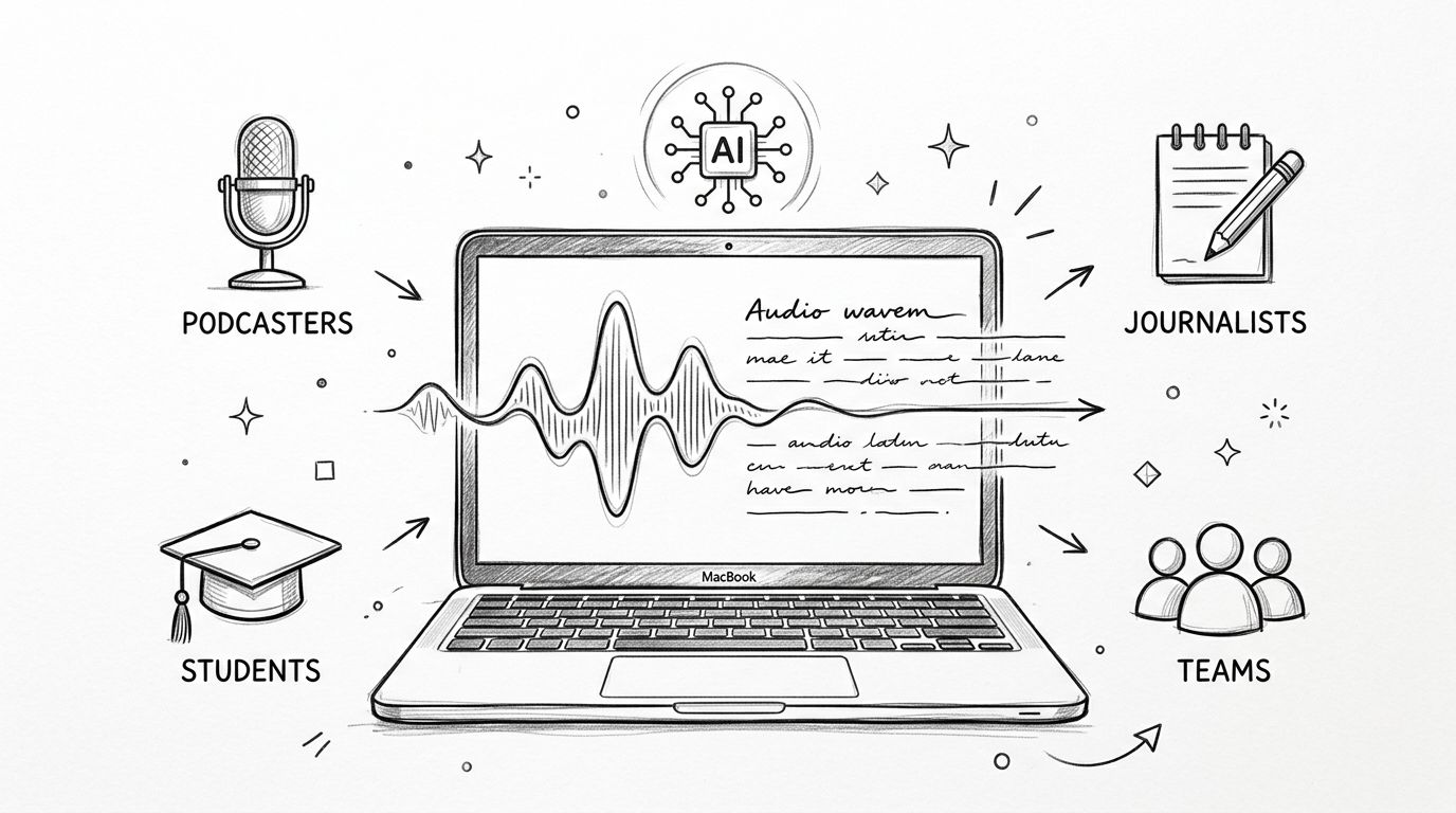
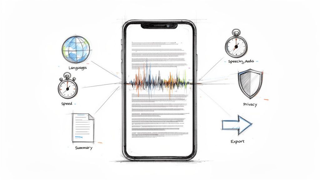
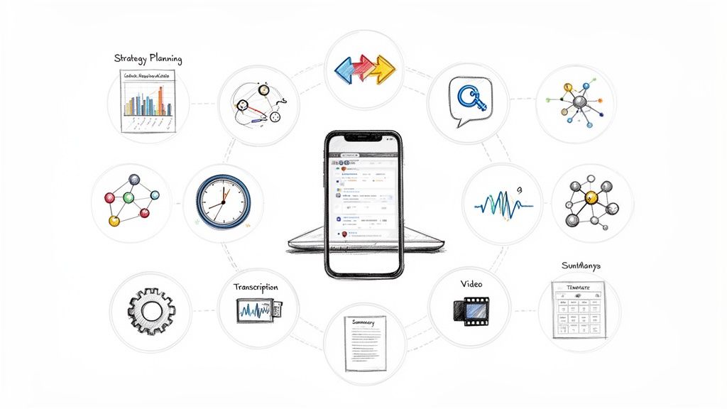
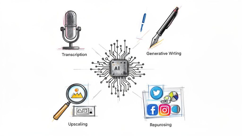
If you're recording pitch videos, filmmaker intros, interview reels, or follow-up summaries, Whisper AI can help turn that material into searchable transcripts, concise summaries, and clean notes you can readily reuse. That's useful when your deck has to work beyond the room and your pitch needs to stay clear across email threads, shared docs, and async reviews.